Financial services · adviser matching South West England
The financial network that earns trust before it asks for it.
Vetted Wealth came to us with a hard problem and a good instinct. Anyone can call themselves a financial adviser, and consumers have no reliable way to tell the difference. We built the answer: a matching network with real editorial authority behind it, live across four counties and still growing.
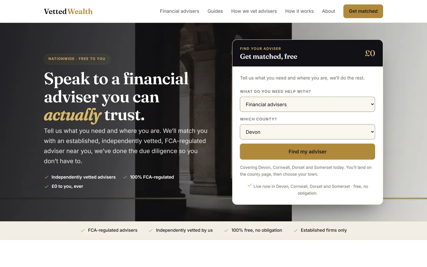
The brief
Vetted Wealth matches consumers with independently vetted, FCA-regulated financial advisers. It is free to the consumer and funded by the adviser firms. The whole proposition rests on whether a stranger believes the vetting is real, which makes it a brand problem long before it is a marketing one.
Financial services is crowded with comparison tables, lead brokers and directories that rank on who pays the most. The client did not want to look like any of them, because they were not doing what any of them do. Looking like the category would have quietly undermined the one claim the business depends on.
What they wanted felt closer to a private bank than a price-comparison site. Calm, serious, obviously considered, and able to scale into hundreds of local markets without ever reading as mass-produced.
Our angle
Most agencies would have built a smart brochure and bolted a lead form to it. We took the opposite view. In a category where trust is the product, a website has to demonstrate expertise rather than assert it.
So we designed a business asset instead of a website. Every town Vetted Wealth serves has its own page, written around what people in that town actually need advice on. Every specialism gets a proper pillar. Underneath sits a knowledge library deep enough that a visitor can understand their own decision before speaking to anyone.
That depth does something a brochure cannot. It earns the right to rank for hundreds of local searches, and it gives a nervous visitor a reason to stay and read. By the time someone fills in the form, they already understand what they are asking for.
We did not want another comparison site. We wanted the place people go when they want to get this right.
The brief, in one sentence
01 / 05
The look
Restraint as a trust signal
We built the identity on a simple observation. Money makes people anxious, and anxious people are reassured by calm. Where competitors shout, Vetted Wealth is quiet. Deep ink navy and warm ivory carry the whole site, with a single gold accent used sparingly enough that it still means something when it appears.
The typography does the heavy lifting. A high-contrast serif gives headlines the editorial weight of a broadsheet finance section, while a clean sans handles everything the reader has to absorb. Nothing is decorative for its own sake.
The imagery is the detail most people notice last and feel first. Instead of the stock photography that plagues the sector, every image across the site is bespoke fine-art illustration in a consistent house style: architectural, understated, quietly expensive. A firm that bought a template cannot fake that, and visitors can tell.
02 / 05
The architecture
A network, not a page count
Scale is easy to fake. A thousand thin pages is a liability, while the same number with real local substance becomes an asset competitors cannot cheaply copy.
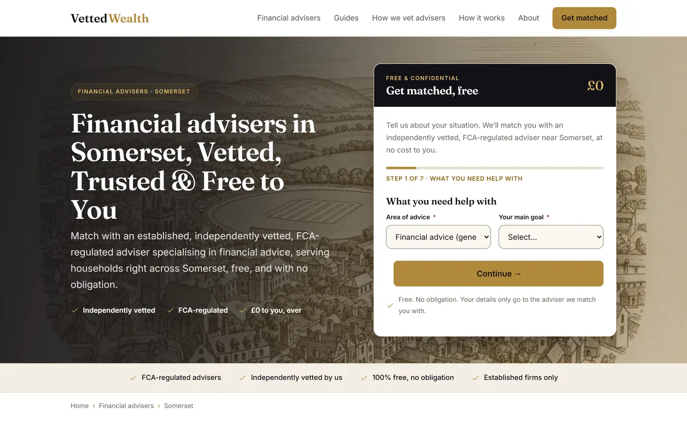
Every location page is grounded in its place: the industries that dominate it, the property market, the kind of wealth that exists there and the advice questions that follow. A retirement town on the coast gets a genuinely different page from a naval city, because the people living in them need different conversations.
The whole network is then cross-linked with intent. Land on any single town page and you can find your way to the neighbouring towns, the other specialisms and the guides that suit your situation. No page is a dead end.
03 / 05
The authority layer
A library that answers the question before the sales pitch
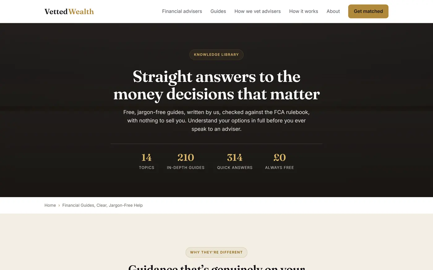
Beneath the commercial pages sits a knowledge library of more than five hundred guides and answers, covering the decisions people genuinely lose sleep over: pensions and drawdown, inheritance tax, what an adviser really costs, and whether they need one at all.
The guides are written to be useful even when the honest answer is that the reader does not need to pay anyone. That is a commercial decision as much as an editorial one, because a visitor who feels informed rather than sold to converts at a far higher rate and comes back later.
The library is credited to a named editorial team, each editor owning their own topics, with a published policy setting out how figures are checked and how corrections get handled. In a sector this close to regulation, that transparency is what makes a reader believe the next sentence.
04 / 05
The craft
The details that separate premium from ordinary
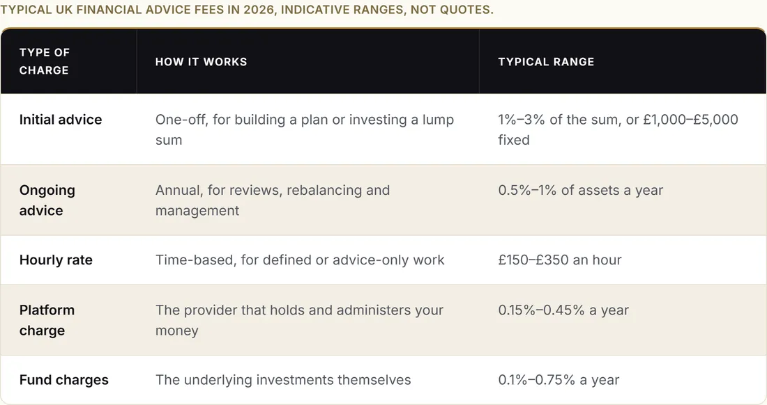
Editorial components were designed rather than defaulted. Comparison tables read like something from a quality financial publication. Fee breakdowns are laid out to be understood at a glance, and case scenarios are written as short human stories instead of marketing copy.
The site was built to feel effortless on a phone, which is where most of this audience actually reads. Layouts reflow properly, imagery stays sharp, and nothing shifts under a thumb mid-scroll.
It also meets the recognised international accessibility standard across every page. For a business serving retirees and later-life clients, that decides whether a sizeable share of the audience can use the site at all.
05 / 05
The commercial engine
Turning attention into enquiries
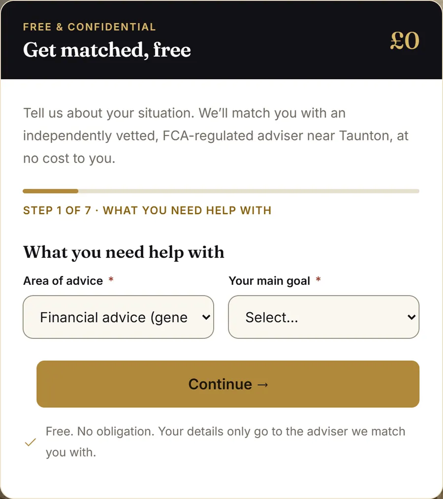
The enquiry journey is deliberately gentle. A short, staged form asks only what is needed to make a genuine match, and it adapts its questions to the advice area chosen, so a pension transfer enquiry and a mortgage enquiry are never treated the same way.
Every enquiry lands in a dashboard the client manages themselves, with the full answer set attached, so their team can qualify and route without chasing anyone for basic information.
The effect is that the site does the qualifying before the conversation starts. The client speaks to people who already understand the proposition, already trust the vetting, and have said what they need.
The design system
Every decision was made once, properly, then applied with discipline across three thousand pages. That consistency is what makes a large site feel like a considered brand instead of a database with a stylesheet.
Where it stands
Vetted Wealth has been live for over a month and brings in enquiries from consumers actively looking for advice. They arrive pre-qualified, with the advice area, timescale and circumstances already captured.
The site covers 179 towns across four counties, with 14 advice specialisms mapped against every one of them, and a knowledge library that gives the brand a real claim to authority in its category.
It is also an asset the client owns outright, rather than rented attention that stops the day the ad budget does.
What happens next
This is a programme rather than a one-off project. The four counties live today are the first phase of a planned national expansion, and the next regions are already scheduled and mapped.
Each phase follows the same method. Research the local market properly, build the depth, connect it into the existing network, then let it compound. The asset gets more valuable with every phase because the authority accumulates.
We work with Vetted Wealth continuously, planning where to expand next based on where the commercial opportunity actually sits rather than adding pages for the sake of it.
See it for yourself. It’s live.
A real authority site we built: vettedwealth.co.uk ↗
Could your market support an asset like this?
Vetted Wealth works because the category rewards trust and depth. Plenty of others do too, and most of them are being served by brochure websites. If that sounds like your market, the first conversation is free and there is no pitch deck.